The reasons for evolving your logo or even undertaking a full blown rebrand are many and varied. Some companies may feel that they have lost touch with a market and need a fresh start, others are experiencing poor results, or even bad press, and they want to leave their old brand behind, while others have changed direction through new innovation and products and want to reflect this in their new look. One of the key decisions to make is whether your business needs a complete rebrand or simply a brand refresh.

A brand refresh or evolution consists of small or subtle changes to your logo that occur over time where the target market aren’t necessarily aware of the changes (Kelloggs and Apple). These changes may modernise the brand image through a change of colour or simplification yet don’t actually change the core messages or brand values. Qantas undertook such a brand refresh in 2017 which has resulted in a more streamlined look.

A revolution or rebrand is far more intense and will be noticed by all. This is where a company changes their entire look, message and even positioning. Woolworths is a very good example of a rebrand that has been both well executed and well received.

8 Mistakes to avoid when rebranding
1. Holding onto History.
Rebranding essentially is a way of staying relevant. The ideals and message of the brand when it was initially established may no longer be the case. Analyse the changes in your target markets when exploring brand expansion, repositioning and revitalisation.
2. Thinking the brand is only the logo.
Your brand includes everything from your brand promise, commitment, culture, brand personality, brand experience, customer perception and experience to quality, look and feel, customer care, selling/retail and digital footprint, communications via both phone and email, and so much more. Changing the logo is not a rebrand – that is simply evolving the logo.
3. Rebranding without a plan.
Effective rebrands rely heavily on a comprehensive creative brief to keep everyone focused. Include sections for a situation analysis, objectives, target markets, budget and resources, time frame, approval structure, stakeholders and metrics for assessing results.
4. Not leveraging existing brand equity and goodwill.
Ignoring the current brand equity when rebranding alienates established customers, while unnecessary overhauls can irreparably damage a brand’s perception. Consider the needs and mindset of the target market carefully before digging into the process. Sometimes a small evolution – or a new coat of paint – is all that’s needed to rejuvenate and make a brand relevant.
5. Not trying on your customer’s shoes.
Simply calling your own number or receptionist may reveal challenges customers face and inform your rebranding strategy. Take the time to navigate your own website, buy your products and return something. Better yet, ask a friend or family member to do so and learn from their experiences.
6. Doing it yourself.
This is too big a job to do yourself. In fact, it has too much riding on it for you to pass it onto your recently graduated graphic design niece. Source a company that has experience in branding. Smart companies recognise the value of a fresh perspective and can offer guidance.
7. Limiting the influence of branding partners.
Good branding consultants are more than graphic designers. The best ones help develop new products, expand demographic focuses and even streamline business operations. Reign them in when needed, but don’t limit their areas of influence.
8. Believing rebranding costs too much.
Design thinking and clever strategy doesn’t have to come with a multi-million dollar payout. You can get thinking designers with solid strategising abilities from small and talented branding agencies. Look around your local area, find a studio with a good portfolio that has the creative style that you are comfortable with.
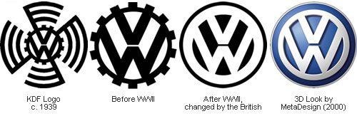
Whatever your reasoning, the reality is that many of the biggest brand names around the world have undergone a logo evolution. Businesses evolve their brands over time to keep them relevant. For example the Volkswagen logo that originally resembled the swastika was redesigned after WWII. Some do it well (Shell for example), while others fall horribly short (Gap comes to mind).
If you are looking to refresh your brand, please give us the opportunity to weave some magic into your brand – we have had some incredible success with many small and medium sized businesses. To see examples of our amazing brand creations please head to our online portfolio.


