Research has shown that association with colours increased brand recognition by as much as 80%.
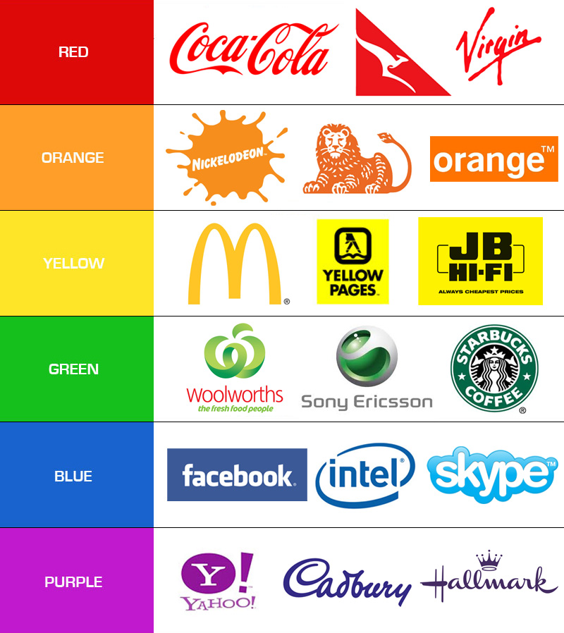
If you were ever in doubt about how much colour relates to a brand take a look at the below well known logos and how differently they appear to the eye when represented in a different colour pallet.

Colour is a visual cue that communicates brand attributes such as traditional or contemporary, dynamic or calm, as well as cultural meanings, political affiliations and environmental stands – just to name a few. In the design of branding, the choice of colour can provide a wealth of powerful messages about your brand.
In the last few years the importance of colour as a brand identity has become a big issue for large companies. In the past it was unclear whether trademark law protected distinctive colours that had become strongly associated with a particular product or manufacturer. Considering the fact that colours are in limited supply, would allowing companies to own a single colour or a colour combination lead to the depletion of all of the attractive colours in each product line?
So what exactly does ‘trademarking a colour’ mean?
“A colour trademark is a non-conventional trademark where at least one colour is used to perform the trademark function of uniquely identifying the commercial origin of products or services. In recent times colours have been increasingly used as trade marks in the marketplace. However, it has traditionally been difficult to protect colours as trademarks through registration, as a colour as such was not considered to be a distinctive ‘trademark’. This issue was addressed by the World Trade Organisation Agreement on Trade-Related Aspects of Intellectual Property Rights, which broadened the legal definition of trademark to encompass “any sign…capable of distinguishing the goods or services of one undertaking from those of other undertakings”.
Despite the recognition which must be accorded to colour trademarks in most countries, the graphical representation of such marks sometimes constitutes a problem for trademark owners seeking to protect their marks, and different countries have different methods for dealing with this issue.
Wikipedia
Many companies have successfully trademarked their colour. Tiffany Blue for example is the colloquial name for the light medium robin egg blue colour associated with the famous New York City jewellery company, Tiffany & Co.
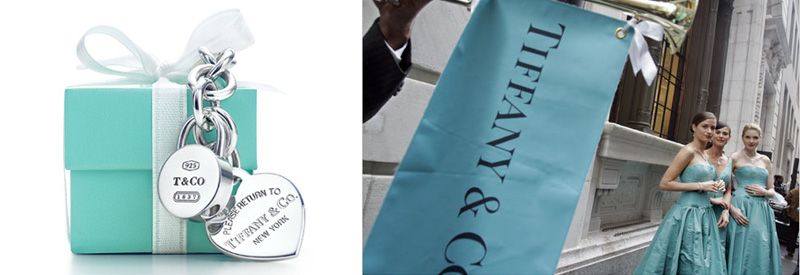
The colour is produced as a private custom colour by Pantone, with PMS number 1837, the number deriving from the year of Tiffany’s foundation. As a trademarked colour, it is not publicly available and is not printed in the Pantone Matching System swatch books. Tiffany Blue is probably the most famous trademarked colour – but just because Tiffany trademarked it – they only own that blue in situations where it could be confused with their products. You could paint your house that colour or even style your wedding in Tiffany Blue, without having a problem.
Given the wide range of products Tiffany sells, and the uniqueness of their shade of blue, Tiffany probably owns that blue for just about any kind of box that jewellery or other gift could come in. To protect their brand from being leveraged off by other jewellers or companies in the luxury gift arena, all they would have to say in a court of law is, “If your spouse or loved one gave you a box that colour blue, would you assume it came from Tiffany & Co.?” Case closed.
Australian and overseas entities have sought to trademark colours, including purple for chocolate and orange for champagne.

Attention has focused on the 2006 Federal Court decision in Cadbury vs Darrell Lea Chocolate, where there was a dispute between chocolate makers about the use of the ‘Cadburys’ purple in the Darrell Lea packaging. The judge ruled in favour of Darrell Lea stating, “I am not satisfied that such usage has resulted, or would result, in … purchasers of chocolate being misled or deceived.”
It is quite clear then, that colour does attribute to a very large role in brand recognition. Coca-cola red, Yellow Pages yellow or Starbucks green all play an important role in providing brand attributes to the brands that they are associated with.
So the question then becomes, “how do I get the right colour for my brand?” The answer is not all that simple. You need to understand the psychology of colour, how it makes people feel and what images they conjure up when they think of certain colours.
Cymbolism is a great site that allows you to vote on the meanings of colour as well as search words and the colours that relate to them. If you get stuck and need help, you can always contact our design team at White River Design who are passionate about colour on 0481 846 481!
