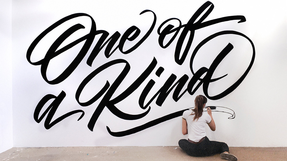
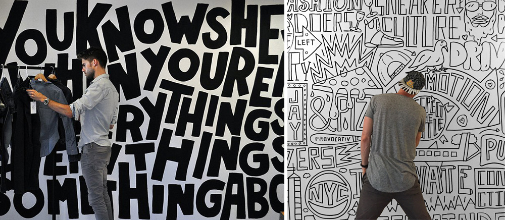
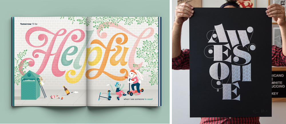
I thought that I might discuss typography in this months blog as it is an ancient and beautiful art that with the invention of computers has been a little overlooked as there is so much within such easy access. Let me state from the start that I LOVE TYPOGRAPHY! I find it quite amazing how much a font can change the look of something. To this end typography is not a science.
Typography is an art.
The use of the right type face, it’s positioning, spacing and intensity can make a lasting logo, eye catching billboard or unforgettable brochure. Use the wrong type face and an entire design or brand can be destroyed. This might sound a little dramatic to you, but hear me out…
Typography as a design element
Many people are unaware of how much thought and time a designer puts into choosing the correct type for their client’s designs. Simply using Arial or Times New Roman is quite frankly not in our vocabulary. In saying that there is always a time and a place for both of these mentioned fonts, so we never rule them out – we simply use them when appropriate.
Fonts can immediately evoke a feeling or emotion, often not by what is being said but rather by what is being seen. To put it simply, the use of typography is to enhance the reader’s experience while ensuring that they can read what has been put before them. Good typefaces are designed for a good purpose and make their words believable, but not even the very best types are suited to every situation.
What is a serif and san serif font?
For those not used to this terminology a Serif font is one with ‘hands and feet’ and the Sans Serif font is without. Traditionally designers have used serif fonts in large bodies of text such as books, newspapers, magazines etc, while the sans serif is used for headings and highlights. This does not mean that you can’t mix things up – this is just the traditional application.
A typographer’s mantra should always be to honour content. This is applicable to both print and web. Some of my favourite typefaces look dreadful on screen; and even good typefaces designed especially for the screen, often look at best mediocre on paper.
What font’s can be used on websites?
In the past, choosing a typeface for your website was much easier owing to fewer choices; however, with the advert of Google Fonts and Adobe Fonts this has certainly changed. So it’s all the more important to think carefully about the type we use. Is Times/Times New Roman—narrow set and designed for narrow columns—really appropriate for long-line extended text on screen?
Using font appropriately
It is essential for a designer to understand the client’s target audience and who will reading the text, so please remember to let your designer know. Lawyers, engineers, mothers, pensioners, children? For example, it’s historically known that 9pt text is not preferable for the over 55’s!
Designers also have to consider where the text will be displayed. The use of typography for a billboard is vastly different to a page layout in a magazine. Sometimes a designer has no control over what else is on the page or the size of margins (such as a newspaper). All these elements can play a very large role in how your type is perceived.
So as you can see, typography really is an art, which also means that the decisions that designers make, including type choice, are subjective.
The good news is that you don’t need to be a typographer, you just need to find a designer that is! How can you tell? Look at their work. If it projects the correct message, looks good and is easy to read, then they are more than likely on the right track. Hopefully this little window into the power of typography will make you look twice at type around you.
If you don’t know where to start finding the perfect designer with typography skills, then I would highly recommend that you turn to the team at white river design as your first port of call – you won’t be disappointed.
