Awards Agency
- Branding
- Graphic Design
- Social Media
- Website Design

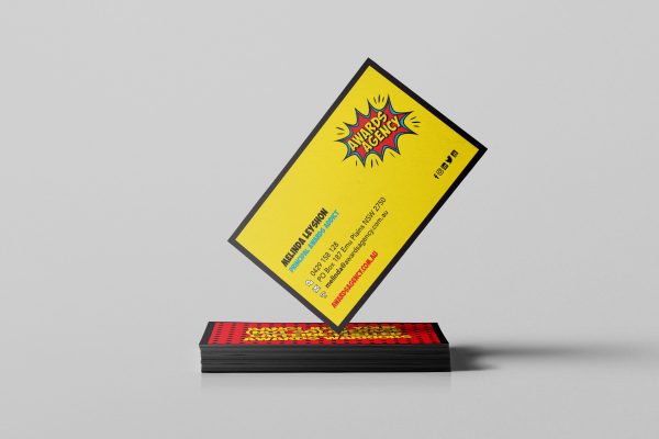
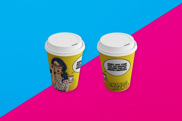
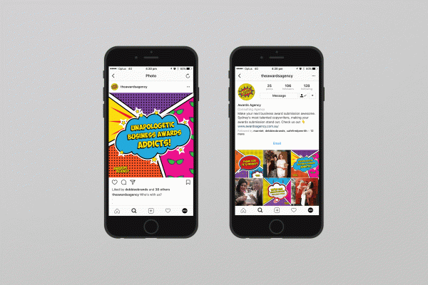
Our client chose WRD as her branding studio of choice as she wanted a brand that immediately connected and resonated with her target audience. She wanted a brand that would stand out and be remembered for all the right reasons. Once that would demonstrate to her clients that she was the authority on awards and tender submissions and THE best person to meet their challenges while delivering results.
During our brief, we discovered that she was hung up on a pre-existing concept that was all about the colour blue. To her, the concept of ‘blue ribbon’ represented first place. Quality. Winning.
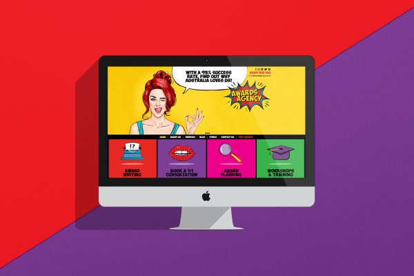
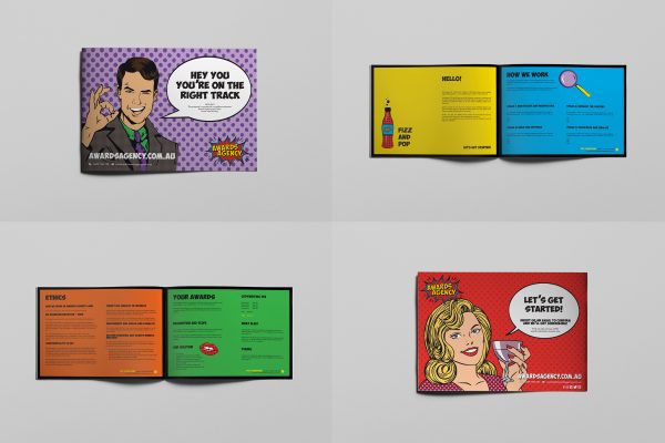
Our first response? It’s playing it safe. It was boring and it was way too obvious! It’s not where she wanted to be, but it was all she could conceptualise. And to us, it just didn’t connect with where she wanted to take the business. With a logo, brand voice, website and associated digital collateral to develop, we needed to develop a solution that met the brief while also packing an absolute punch. We had some work to do. After all, she was after a brand that stood out, but mentally locked into a concept that blended in. So we started with her Brand Personality… and it paid off as we won a Sydney Design Award and an International Stevie Award for this brand.
awardsagency.com.au

