White space is a designers best friend.
Sadly it is often a clients biggest bone of contention.
White space or negative space as it is sometimes referred to, is a design element that allows objects to breathe. It should not be considered ‘blank space’but rather an important design element that allows positive and negative space to work well in a balanced composition.
White space adds aesthetic value and acts as a highlight. You might not like spiders, but there is no doubt that through the use of white space, we have been able to make it a dominant feature of this article!
The use of white space enhances elegance and style. It can assist with successful communication. Text is easier to read when it has white space around it and images appear clearer and have more of a spotlight effect on them. White space allows an area to resonate without being overwhelming. It allows the eye to rest while still directing the viewer to the message.
An example of a good use of white space.

An example of bad use of white space.
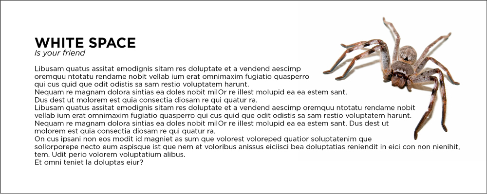
Unfortunately, many clients get nervous when they see white space. They seem to feel the need to fill the space, thus destroying what would otherwise be a clean, measured layout. From a design point of view a page crammed full of text and graphics with very little white space runs the risk of appearing busy, cluttered and typically difficult to read.
Designers often combat some of these challenges with the clever use of font type, text spacing or graphic sizes. But when we have a client that insists on filling every available space, we find ourselves working on a job that will never reach its true potential.
Sometimes white space is not relevant to a particular brand as they might be more of a budget brand. However, with the use of negative space a brand can appear more contemporary, sleek or classic. You will notice that many upscale brands will use white space in their marketing. Take Apple for example – their use of white space immediately sets them apart from IBM or Dell.
So when your designer next proposes a layout that utilises negative space, don’t see it as a blank spot but rather breathing room for the rest of your content to shine. If you would like to discuss your design needs, feel free to contact our creative team on 0481 846 481 or email us.

